Thursday, 7 May 2015

Perfume Part Four


In this shoot I was helping to assist some other students in the morning and then I had my own shared studio time on the afternoon. They had set up the studio with three lights, two softboxes; one on either side of the table and one behind the table bouncing light off the white background and through a diffuser screen.

Outcomes


These photographs show a bottle that I have borrowed from one of the girls I was assisting, the shoes are also hers; I combined them and the perfume because of the gold within them both. I am not sure about using the flower because I know it is not a flower that the perfume smells of.


I tried some photographs without the flower in and I found that I prefer these photographs more. The photograph on the left was taken without a reflector and the one on the right was taken using a small white reflector from underneath the camera to bounce light onto the lid. I also moved the shoe because of the reflection that was showing and because the shoe blocked the detail on the writing on the bottle.


These photographs I took just of the bottle on its own, I prefer the photo of the bottle without the lid on because I kept forgetting to rearrange the reflector and the detail in the lid was lost. I also like the minimalistic look to this photograph and I think it suits this bottle.


I like the way the colour pops out in this bottle however I do not think I could use this bottle as a final because it is only half full and this would not be used as an advertising piece but it was good practice to be able to use this bottle. In the photograph on the right I want to change the reflection so that the writing reads the right way up however I do think that it would look right and could confuse many viewers. I like the petals in the photograph as they help tie in the flower.


I think that this flower matches the delicate "girly" nature of this perfume, the colours compliment each other however I think the flower looks a little like it is dying and if I was going to shoot again I would use a few of these flowers in a bunch. I prefer the photograph where the flower has a little of its stalk showing because then it is obvious that the flower is a flower.


The differences between these two photographs is that in the left photograph the flowers are real and in the right photograph the flowers come from a headband. I prefer the fake flowers as the colour matches better; also I do not think it is obvious at first look that they are fake. I do not like the positioning of the flowers in either of these photographs as I think they overcrowd the bottle.


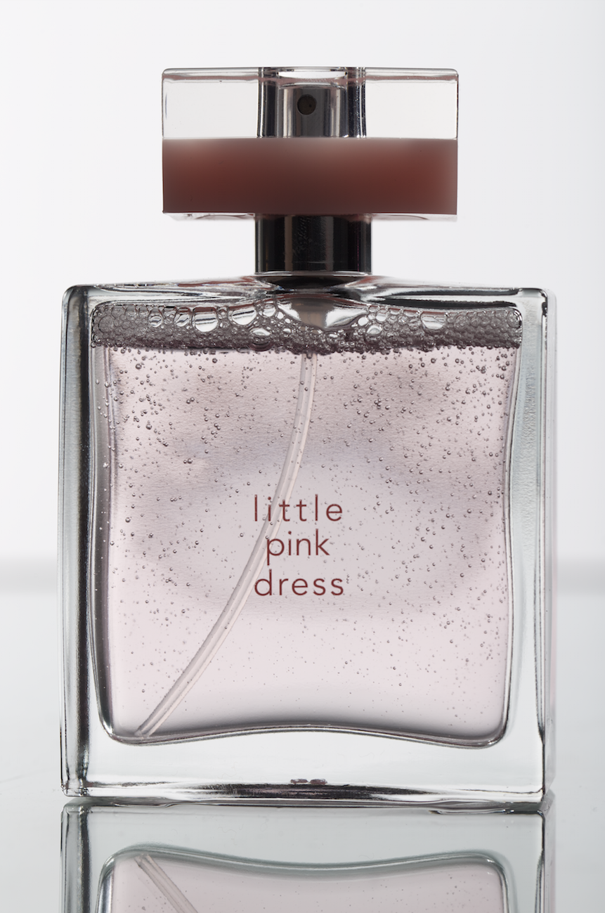
The flowers in the right photograph look better because in the left photograph the writing on the bottle gets lost, to raise the bottle I have sat the bottle on a roll of masking tape that it sat behind the flowers out of sight. I also tried some shaken bottle photographs but because the bottle was difficult to stand on the tape it was difficult to shake and balance the bottle while the bubbles were still visible. I think I am going to develop the right photograph some more as one of my final photographs because this is one of my strongest photographs that I have taken so far.


In these photographs I added a string of beads to the bottle, I did this because the perfume is aimed towards females and the beads help add to the connotations of femininity. I prefer the photograph where the bottle is sat on the black material as it helps break the colour up. I also think the pink box does not look right as it is not a full box but it is the box that the perfume comes in, I used this box because the pink colour matches the bottle however I think it needs the black to highlight the bottle.


I thought I would expand the black material because of how it contrasts with the bottle however the writing on the bottle is not very visible so I move the black cloth up to provide more of a background for the bottle. In the photograph of the bottle on the right it appears as though the bottle is wearing a cape of the black material and I quickly realised that I would have to move the background up so that it covered the full background.


In these ones I have moved the black cloth so that it created a full black background, this looked instantly better than before however the photograph looked slightly empty so I combined both the bottles in the frame. I had to rearrange the bottles so that the lighting hit both the writing in the bottles, I also had to use reflectors to change the lighting on the pink bottle.


In these photographs I changed the angle on the camera to be able to take overhead shots. I think the shape of the air bubble in the pink bottle but I think the bubble in the red bottle is too large however. The backgrounds match the bottles very well, but I think I need a reflector in the red bottle because the details in the lid are slightly lost.


I tried using this bottle as well as the "Little Dress" bottles in an overhead shot. For this bottle I sat it inside a roll of masking tape so that it appeared as though it was standing up. It took a while for me to be able to angle the bottle so that the writing in the centre was visible. I then realised I would need to more reflectors than what I had to change the reflections in the lid. I am going to try continue with this bottle for my final as I think the outcome on the left is another of my strongest so far.


Set Up


Wednesday, 6 May 2015

YSL Black Opium


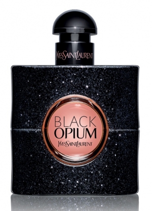
This is an example of the advertisement used for YSL Black Opium perfume, the bottle has a halo light around the outside which can easily be added in Photoshop. The glass centre in the bottle has been lit so the colour can be clearly seen while also showing the details in the sparkles and the writing on the lid, personally I think this is a composite of many different shots with different lightings as not all the parts of the bottle would be visible at once.


These are some other photographs of the bottle I have found which caught my eye as they are very different composition wise.


Tuesday, 5 May 2015

Little Dress (perfume research)


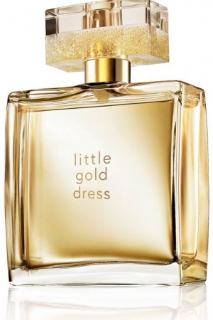
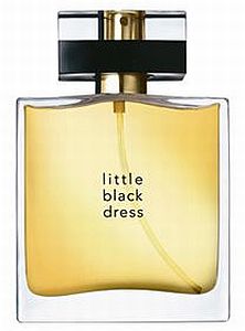
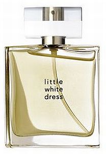
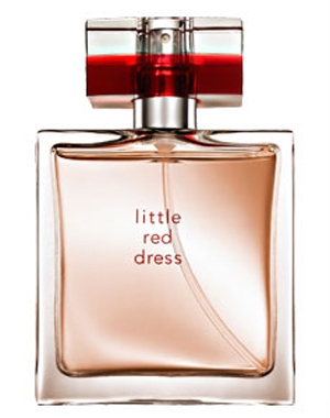
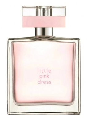
These are all example photographs of the bottles in the collection, there are also different versions of some of the bottles as they have released different sizes and special editions. In some photographs the inside stem of the lid has been removed and in others it has been kept in, I am not sure if I want to remove it in my photograph of this bottle as people expect it to be there and visible and removing it could cause some confusion. In none of these photographs the bottle has been shaken so there is bubbles inside the bottle, I still prefer my own shots with the bubbles visible so I think I am going to continue shaking them. From the reflections on the lids the bottles appear to be lit with softboxes on the side, some bottles look to have two but others have one.


Little Pink Dress


These are some of the photographs of the Little Pink Dress bottle when being used in an advertisement. I like the idea of combining the bottle with props, but since this is a "Still Life" module I am not going to be including models, however flowers and other props can still connote femininity.


Little Red Dress


In this photograph the pattern in the background mimics the pattern from the front of the box, I might try combining this pattern with the bottle however I am not sure how I could create this.

Perfume Part Three


In this shoot I shot a white background with the bottles of perfume placed on a sheet of glass with black card underneath, I changed to black card because this brings out more details in the reflections and it will be easier to remove the reflection if I decide it is too much later rather than trying to create one. The lights are aimed towards the background which is bouncing lights back into the bottle from behind, my friend was sharing the studio time with me and she was lighting glass and this a technique she found for lighting glass so I wanted to try it and see if it would be possible to use for perfumes.


In these photographs I have photographed the bottle trying to show the writing in the centre because it is written on the glass. On the lid "Yves Saint Laurent" is written, I tried using reflectors to light this however to properly light this I will need to rearrange the lights so more light hits the side and the writing.


I like this bottle and I am thinking of developing more ideas for this bottle to be one of my finals. But I do not think this lighting works for this bottle because of the dark pattern that shows through the glass. Also I still prefer the shaken bottle to the still one.


For these photographs I tried to combine both the perfumes from the "Little Dress" collection as these are the only two that I have from the same collection. I prefer the bottles with more space between them because when they are too close it appears too squished. To get both of them looking shaken I had an assistant shake one bottle while I shook the other and pressed the shutter.


Once again I tried using hands within my photographs, however I just didn't feel that it was working still so I did not develop this idea much further.


I had brought some props in that I thought would compliment this bottle as I am thinking of using this as a final. The beads are just a necklace that I found and thought matched the colour of the bottle.


For these photographs I tried using Glycerine droplets to imitate a spray from the bottle; I sprayed the droplets onto a sheet of glass and I held it up infront of the bottle, But I think the droplets were too watered down to be able to stick to the glass as they ran down almost instantly. I tried again where I sprayed the glass while it was laid flat and waited for them to dry onto the glass, this still did not work though.


These photographs were taken using a snoot to light the bottle, In the second photograph there is a mirror behind the bottle because I was using it as a reflector and I thought that the reflection could look interesting. After talking to my tutor about these photographs he think that the bottle look to much like a christmas tree bauble and that I should try this again on a white background.


Monday, 4 May 2015

Avon Instinct (perfume research)


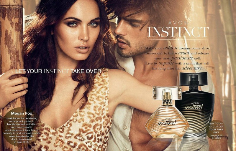
This is one of the advertisements made for the Avon perfume "Instinct" in many advertisements the bottle does not take a high priority within it but it merely featured so that the viewers know the bottle and what to look for when purchasing it. Even though the bottle is only going to be featured small it needs all its key details to be shown. 


This is an enlargement of the bottle from the advert shown above, in many of my shoots I have been struggling to find a way to light this bottle without any highlights showing but in this photograph there are still visible highlights on the bottle. It looks to have been photographed with two softboxes at the sides of the bottle which is how I have been photographing the bottle.