Showing posts with label Documentary. Show all posts
Showing posts with label Documentary. Show all posts
Thursday, 5 March 2015
Documentary Crit
Feedback I was given was very helpful:
print quality --- check its on a calibrated screen
the captions --- didn't need the full caption, only the first half
print them bigger --- separate images instead of series --- but i did this to show a series, single image didn't work as well for the context
going to retake them --- came out too dark, gunna brighten them and get the quality up
backgrounds --- added more to the image and worked well

Documentary Still Life Shooting
Shoot One
For my first shoot I was experimenting with the jewellery however I realised I have shot the jewellery in more of a commercial style (as this is my preferred style rather than documentary) only one of my images the tutor said could work for this mini project and I would need to shoot again in a more documentary style. Many of the photographs show the jewellery against a black background and this makes them appear very commercial and advertising, I am using a macro lens to shoot with so I can show more of the details in the necklaces as they are only small objects. I also experimented with a sheet of highly reflective material as I thought that the reflection could be visually appealing however I feel that the refection is quite overwhelming as the jewellery is too highly detailed.
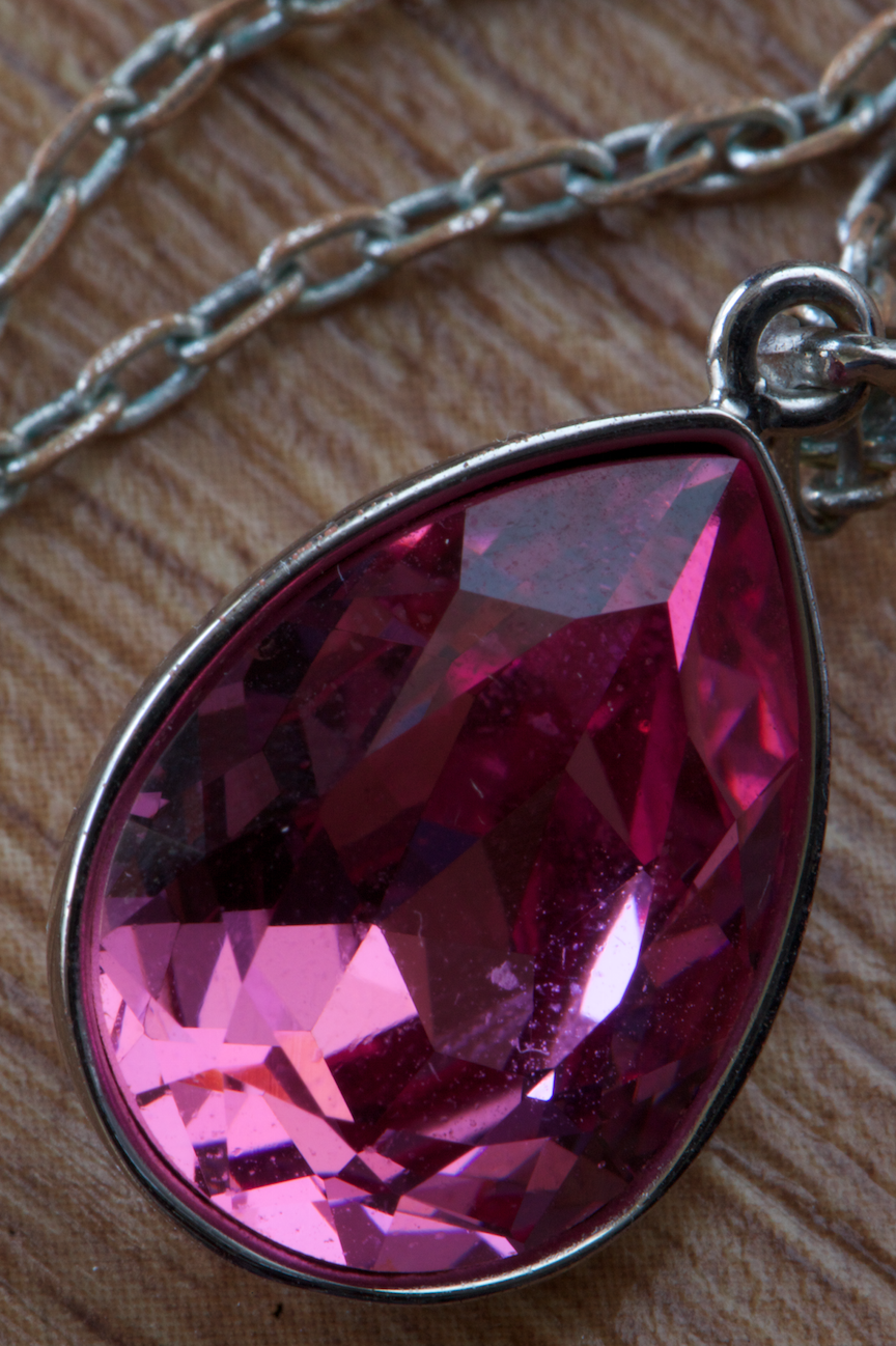
This was taken sat on a desk using a macro lens, I think the way the necklace shows the rust in the chain takes away from the product / advertising feel of the work.

In this image I like the way that the necklace flower contrasts with the soft drawing of the flower.


In these photographs I have shot a bracelet that is sat on a sheet of highly reflective black material. In the second photograph I have used the light meter bag to block out the back of the bracelet as I thought that the silver was distracting, however it can be seen as it has light falling on it. Also looking at both the photographs after the shoot I think that the silver adds more to the photograph as it breaks up the blue some more and can not be seen as much as I had previously thought.


These images show some of the close ups of the necklaces and I can understand why my tutor thinks that they appear very commercial and product style. I think they are successful images just not in the context of a document of the jewellery that a person wears.


In these photographs I have created a bokeh effect by placing a string of silver beads on the boom arm behind the necklaces and used a shallow depth of field so it is out of focus. I think the effect works because it breaks up the background and adds something more interesting to look at rather than plain black.

This is the jewellery box being used as a background for the necklace, I do not think that this is successful though because of the line through the bottom of the photograph.

This is a photograph showing a necklace and the matching earring set in the box, it was difficult to be able to bounce the light back into the shiny gems that are on the necklace using natural light as it was drawing to end of the day and the sun was disappearing. It was also hard to be able to light the bottoms of the jewellery because they are see through so were easily blown out.
Shoot Two
For my second shoot I followed my tutors advice and I have tried to incorporate more of a documentary style so I added in a background, an item of clothing that the person would/could wear the jewellery with. I think the materials add more context into the photographs as it places the necklace in a location and makes the viewer wonder about where it is and I think when I add captions into the images then the context will be more obvious.


Text
For captions I am not sure if I want to stick to a factual 'price, when it was bought...' or if I want to fabricate a memory for each necklace. I think for a documentary style series fabricating a memory would be more appropriate as this would add context that can be easily read into. I added captions to each of the images, the first two are real captions but the final image has a fabricated story added to it as I felt the story was too similar to the second photograph as it had also been bought in a store.
Outcome


Thursday, 26 February 2015
Documentary Still Life
Narelle Autio - "The Summer Of Us"
The exhibition layout of this series reminds me of how some people collect and layout memory photographs on their walls in their houses. It creates a more personal connection between me and the photographs because I feel I can relate to the connotations of a memory wall.
The minimalistic style of this work adds more aesthetic quality because they are visually similar so they all create focus on the objects rather than the location, I think if these had been taken with sand and other objects in the background they would lose some aesthetics because the focus wouldn't be solely on the object.
http://www.stillsgallery.com.au/artists/autio/index.php?obj_id=series&nav=8
Raphael Dallaporta - "Antipersonnel"
He has photographed different land mines as though they are a high end retail item; personally I think this gives a striking juxtaposition of the styling in relation to the object itself. The lack of background in this series only highlights the object more. If this series had been taken differently (on location with background detail) I think it would have lost effectiveness of the juxtaposition however it would have been more effective in showing the destruction it can cause if it had been shown in the aftermath of the explosion.
The context of what the objects are give a deeper meaning to the photograph and change the perception and how we receive the photograph.
http://artblart.com/tag/raphael-dallaporta-antipersonnel/
Subscribe to:
Posts (Atom)