Thursday, 26 March 2015
Montagers
In lecture today we were introduced to some artists who create digital montages:
Richard Prince
He uses public domain photographs to create his works, using selfies that people have uploaded to social media sites and then adds his own captions to them. I do not know if it has been staged or if he has actually taken peoples images. It would be easier and more morally right to stage the photographs as I feel too many people would object to having him recreate their photo's in the way he does.
Michael Wolf
He takes screenshots from google street view, his works has taken influence from paintings however he does not have total control over the outcome because he is using pre-existing photographs, while I think it is an interesting concept this is not my style of working and I would not want to work in this way.
Mari Mahr
She takes photographs of printed works but with an object placed in front. I think this is an intriguing concept and I would be able to use this style in commercial works but I do not want to use this idea for my montage.
Thursday, 19 March 2015
Vanitas Photography
For this workshop we had to decide as a group which Vanitas painting we wanted to look at for influence. Our painting is called "Vanitas still life" by an unknown artist thought to be Georges De La Tour (a French artist) or somebody from his circle.
We had our first photography session in the studio on thursday afternoon however instead of going straight to shoot our group spent this time planning and organising what props could be used in this photograph and who in our group had what. I think this helped us on Friday morning when we had nearly all of the props available to us straight away and we were able to set up and get started almost instantly (we got set up but then had to wait for the store to open to be able to take out lights and the camera).
As a group we had many different ideas so we combined our efforts and took a group photograph that could be presented at the crit and we were all happy with it, plus we each took a selection of photographs that used our own idea that we had thought of.
I changed my personal photograph to include more of the chess pieces as this was my idea to put them on the board as our board was quite flat in comparison with the painting and I thought this might help add more detail and make it stand out more. I also added in the other half of the orange slice to hide the tag from the library coding on the book as I thought this was very distracting and removed the element of painting-ness rom the photograph.
We used a black curtain that hangs in the studio as a backdrop because we were sharing the studio space with another group who were on the other side of the curtain. Once they left we could have removed the curtain however we found that we thought the detail in the curtain was not distracting us and added more small detail to the backdrop and this was liked so we kept it in. Plus our photograph was not as close up as the painting; in the painting there is very little background above the guitar so details are not needed, in our photograph there is more room for background furthermore because of our light set up (soft box from overhead) it appears as though there is a spotlight highlighting the skull specifically. We also started with a black cloth covering the table but this appeared as though the objects were floating and we also realised in the painting that there was detail from the table (after we had set up all our scene quite perfectly) so we removed the scene and the cloth and set up again.
This is the photograph that we made as a group:

Objects and their meanings
These are the objects used in the photograph and the possible hidden meanings each one represents.
Mortality, inner contemplation and eternity
Mirror
Temporary nature of beauty, vanity should be avoided
Guitar
Indulgence in luxury, music would inspire artists, expensive
Flowers
Life is temporary, reminder of death
In Netherlands tulips are collectable, a symbol of the folly
Sword
Military power, superior craftsmanship, beautiful but deadly, vulnerability, phallic symbol, power, protection, authority
Books
Human knowledge
Oranges
rotten fruit symbolises aging, peaches/figs/plums have erotic undertones
Money and Purse
Beauty, narcissism, arrogance, signal their owners absence (purse, jewellery box)
Chess Board / Cards / Dice and Shaker
Signal life, anonymity as gamblers are all equal
Outcomes

The photograph above was taken while some of the other members of the group had gone on a props scout (for flowers and fruit) before this image was taken the chess board had no pieces on it and there was nothing to attract the eye or make it stand out, I experimented with placing different pieces onto the board (probably not in their right places as I do not understand or play chess) I also moved the purse around as when we replaced the skull with another the purse blocked off part of his face.

This is the photograph I styled and took for myself, I moved the spare orange slice to hide the label on the library book (so I did not have to worry about the retouching later on) and I placed more chess pieces around the photograph to add in extra detail and tie in the chess board more with the rest of the objects.
Wednesday, 18 March 2015
Assisted Vanitas
Because two of my friends were absent on the time that their groups had chosen to photograph they set up their own Vanitas style scene.
Because I had shot my own version I said I would help assist them in their shoot.
Here is their outcome:

Thursday, 12 March 2015
Modern Day Vanitas
This is a collection of links showing some Vanitas works that have been created using modern objects and representing the current societies obsessions and meaningless objects.
http://cargocollective.com/bwalant/Modern-Vanitas-Scholastic-HONORABLE-MENTION-Award
http://www.thelittlechimpsociety.com/2009/12/david-cahill-vanitas-memento-mori-skulls-n-stuff/
https://www.flickr.com/photos/kierenplowright/6910913689/
http://foreign-encounters-tamara.blogspot.co.uk/2013/09/vanitas-art-ie-paintings-with-skulls.html
https://stevemiddlehurst.files.wordpress.com/2014/07/nk15062-shape-black-vanitas.jpg
http://www.southwestart.com/articles-interviews/emerging-artists/gluck-d-dec2013/attachment/vanitaswitheggs
Thursday, 5 March 2015
Documentary Crit
Feedback I was given was very helpful:
print quality --- check its on a calibrated screen
the captions --- didn't need the full caption, only the first half
print them bigger --- separate images instead of series --- but i did this to show a series, single image didn't work as well for the context
going to retake them --- came out too dark, gunna brighten them and get the quality up
backgrounds --- added more to the image and worked well
Documentary Still Life Shooting
Shoot One
For my first shoot I was experimenting with the jewellery however I realised I have shot the jewellery in more of a commercial style (as this is my preferred style rather than documentary) only one of my images the tutor said could work for this mini project and I would need to shoot again in a more documentary style. Many of the photographs show the jewellery against a black background and this makes them appear very commercial and advertising, I am using a macro lens to shoot with so I can show more of the details in the necklaces as they are only small objects. I also experimented with a sheet of highly reflective material as I thought that the reflection could be visually appealing however I feel that the refection is quite overwhelming as the jewellery is too highly detailed.
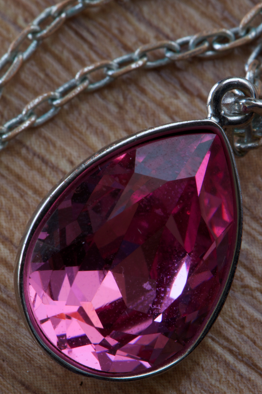
This was taken sat on a desk using a macro lens, I think the way the necklace shows the rust in the chain takes away from the product / advertising feel of the work.

In this image I like the way that the necklace flower contrasts with the soft drawing of the flower.


In these photographs I have shot a bracelet that is sat on a sheet of highly reflective black material. In the second photograph I have used the light meter bag to block out the back of the bracelet as I thought that the silver was distracting, however it can be seen as it has light falling on it. Also looking at both the photographs after the shoot I think that the silver adds more to the photograph as it breaks up the blue some more and can not be seen as much as I had previously thought.


These images show some of the close ups of the necklaces and I can understand why my tutor thinks that they appear very commercial and product style. I think they are successful images just not in the context of a document of the jewellery that a person wears.


In these photographs I have created a bokeh effect by placing a string of silver beads on the boom arm behind the necklaces and used a shallow depth of field so it is out of focus. I think the effect works because it breaks up the background and adds something more interesting to look at rather than plain black.

This is the jewellery box being used as a background for the necklace, I do not think that this is successful though because of the line through the bottom of the photograph.

This is a photograph showing a necklace and the matching earring set in the box, it was difficult to be able to bounce the light back into the shiny gems that are on the necklace using natural light as it was drawing to end of the day and the sun was disappearing. It was also hard to be able to light the bottoms of the jewellery because they are see through so were easily blown out.
Shoot Two
For my second shoot I followed my tutors advice and I have tried to incorporate more of a documentary style so I added in a background, an item of clothing that the person would/could wear the jewellery with. I think the materials add more context into the photographs as it places the necklace in a location and makes the viewer wonder about where it is and I think when I add captions into the images then the context will be more obvious.


Text
For captions I am not sure if I want to stick to a factual 'price, when it was bought...' or if I want to fabricate a memory for each necklace. I think for a documentary style series fabricating a memory would be more appropriate as this would add context that can be easily read into. I added captions to each of the images, the first two are real captions but the final image has a fabricated story added to it as I felt the story was too similar to the second photograph as it had also been bought in a store.
Outcome


Subscribe to:
Posts (Atom)