Thursday 30 April 2015

Perfume Part Two


So in my previous shoot I shot with a black background, in this shoot however I am going to be shooting on a white background.


My Outcomes


The photograph on the left is from the beginning of this shoot, when I first started shooting the softbox reflections were showing up, I fixed this by taping down a white piece of card over the top of the perfume in a tunnel shape to act as a diffuser and to remove the harsh reflections, this left me with the image on the right where only slight reflections are visible from where the paper has lifted up.


As I was using a 24-105mm lens for this shoot I have decided to get closer to the bottles because then more of the details in the bottle will be visible. I could have still got closer to the bottle however I left some space around the bottle because in many perfume adverts there is text and logo's included on the page.


 This bottle is another glass bottle as many perfumes are, I was worried that the colour of the perfume would become washed out but because of the lighting set up however these photos show the unedited versions. I prefer the bottle with the lid on because the clear spray gets lost on the white background, if I was to use a coloured background then I feel that the photographs without the lid would be better because the lid looks rather clunky on the bottle.


This bottle has a silver lid which was difficult to light properly at first because I did not realise the orange reflection down the centre was the reflection of me, I realised this though and started taking photographs using the capture one software.


I tried combining both the bottle with the box, I used this bottle because I had just bought it recently and kept the box for this project. I think that combining both the box and the perfume helps the viewer identify the brand when going to purchase it.The hand position looks awkward in the second photograph however and this will need more work, it is my hand reaching for the box from behind the camera so I will need to look for another hand in order to be able to do this more effectively.


I have taken some more of this bottle just on it's own, I prefer the bottle on the right where I have shaken it and there are bubbles visible, I am thinking of retouching the unshaken line onto the top of the shaken one so that it is smooth. I also prefer this bottle with the lid on because it balances the top and bottom of the bottle.


 This bottle is another in the "Little Dress" collection available I also prefer this bottle to be shaken with all the bubbles inside. I have the box for this perfume as well and I also tried some combined shots however when I was opening the box I damaged it so they did not work out.


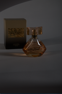
This is the "Avon Instinct" bottle which I had shot in the previous shoot, this lighting set up worked much better than previously. The writing is much more distinguishable in these photographs which is better because the viewer needs to be able to understand what the product is. I have taped the piece of card over the top to act as a diffuser to remove the harsh highlights on the bottle.


I have shot this bottle again with this lighting, I have managed to get rid of the softbox reflections however because of this lighting set up it washed the colours out in the glass section of the bottle. I think to fix this I would need to play with some black reflectors in order to stop as much light hitting the glass section. I also tried again with some shots including the hand, I tried to make it look as though the hand was spraying the bottle, however I couldn't spray the bottle or it would land on the camera lens.


This bottle was also much easier to light in this new set up, I still needed to use a small white reflector to bounce some light into the bottom of the glass however I found that this made the side of the bottle appear washed out.


This bottle is highly reflective and I needed to use some reflectors at the front of the bottle as well as the tunnel shaped reflector over the top of the bottle. I will need to work more on lighting this bottle because in the photograph on the left there is still a reflection of the camera. I tried fixing this by placing a white sheet of paper with a hole in the centre over the camera lens however some of the black from the camera lens was still visible. I also raised the angle of the camera and shot on a downward angle this removed some of the reflections as seen in the right side photograph.


I then removed the lid of the bottle hoping that it would remove the rest of the reflections, it kind of worked all that is visible is the reflection of the lid and the camera over the spritzer. I was using the small mirror as a reflector to bounce some pink lighting back into the bottle, I decided to try standing the bottle on the mirror however this just increased the reflections.


I then tried this bottle again because I wanted to be able to use the mirror successfully in this shoot, I think for it to be successful though I will need a bigger mirror that fills more of the frame.


Set Up


This is the tunnel shaped reflector I had taped to the set up over the top of the bottle, even though it is not fully over the bottle it still worked as a diffuser to remove the harsh highlights from it.


Tuesday 28 April 2015

Perfume Part One


For the second half of my project I am going to be shooting perfume bottles, I have chosen this because I am interested in trying to imitate a commercial style brief in which I would create work for a client. I think that working with perfumes gives me unlimited creativity and possibilities as each perfume brand is different and would require a different atmosphere and theme.

For my first shoot I have taken a few bottles into the studio and practiced being able to correctly light them. I think that the shoot was a success because a few of the problems I ran into I managed to overcome.

My Outcomes


 These was taken with two softboxes, one on either side of the bottle. The bottle is stood on a sheet of glass which has black card underneath so that the reflection is visible, I think the reflection adds to the photograph because without it the bottle would appear to be floating in mid air.I do not the reflections in the bottom of the bottle and I would need to rearrange my lighting in order to get rid of this.


Being able to light this bottle was quite difficult because the whole bottle is made of glass so the reflections were difficult to get rid off. I managed to solve this by rearranging the bottle so that it did not reflect the soft box light. Another problem with lighting this bottle was that underneath did not get the light hitting it and angling the reflector was difficult because I could not find one small enough to work properly.


This is another bottle that is made of glass, this was more difficult to light because the writing was on the front yet the patterned lines are on the back and these show through more than the writing even though the DoF is only wide enough for the front of the bottle to be in focus. Another problem is that the lights caused parts of the bottle to be blown out and this is very distracting, I could not manage to completely get these to disappear and this will need more work.


In magazine adverts typically there are multiple perfumes on one page so I wanted to try being able to light multiple bottles at once. In the first picture the bottle of Beyonce Heat did not light as I'd hoped I'd be able too so I changed it to a bottle of "Intimately Beckham" this lit much better. I used a black silk cloth as the background and placed different sized boxes underneath to change the heights of the bottles as I prefer this to just a line of bottles.


The photograph on the left was taken with having the glass placed on two saw horses and lighting the bottle with a snoot placed on a floor stand pointing up at the bottle, I was using a reflector to try and fill in some of the light when I accidentally caught it in the shot as I dropped it trying to press the shutter at the same time as holding it, I like the shadow in the photograph although I will need to improve on the outcome. The second photograph was taken by two softboxes on either side because I was trying to improve on the coloured shadow from the first image.


I took these with the box in so I could add something extra to the photograph, I used black pieces of card in front of the softboxes to try and remove the glares however this just made the photograph get darker and the flashes were already on full power.


Thursday 16 April 2015

Montaging


Creating my montages was quite fun because I had an idea in my head of creating some advertisements and I continued on from my Product workshop in which I had photographed some cans of coke. I continued this and photographed the cans again with more positions and lighting in order to get the least amount of distracting reflections on the can.

Fanta

My first montage I created was for Fanta Orange. At first I laid out the cans so that the logo appeared to be wrapped around them as I found that cutting out the logo from an image of the can made the writing look curved (see First Attempt below). However this did not look successful because there was also the writing from the cans and it all appeared very squished and cluttered. I changed my composition so that the cans and the Fanta logo were separate, I did keep the same curved writing though as I think the effect helps link the viewer back to the cans and it has more aesthetic than the typical typographies. I added in some images of leaves because I thought the cans looked odd appearing to float and the bottoms of the cans could not be cut out properly because of the angle of the shots, I then tied in the leaves with the writing and made them appear to be falling down across the page. I still thought that the whole image looked awkward with the objects just floating so I used the colour picker to select an orange from the can and used that colour to create a background across the bottom. I also added in a photograph of an orange that I had found on an image search so that viewers could get an understanding of the flavour without having to look closely, however then I added in the same can typography of the word "orange" so it was even more obvious.

First Attempt


Final Outcome


During the process of creating this montage I tried to take a screenshot (on a mac thats cmd shift 4) instead however I miss pressed the buttons and ended up with this result :


I did not know what I had done and how to fix it as there was nothing I could "Undo" i started panicking that I had broken my entire document so my friend went to ask the technician and he instantly knew how to fix it and I was so grateful for it. Turned out I had turned off the colour channels by pressing cmd 4, which means when i tried to take a screenshot i did not press the shift button.


Coca Cola


I followed a similar style to my first montage and placed my cans on the side of my document, I wanted to fill in the space around it so I went online and found a coke logo which was surrounded by some bottle tops. I placed this into my document and used the cloning tools to paste more bottle tops across the top and I think that this adds more interest to the montage. I also added a colour selected background because I did not like the way the objects floated.


Without logo


Final Outcome


Coca Cola Cherry


I wanted to create a set of the different coca cola flavours so I used the flavoured cherry can in which I tried to set the composition the same, however I found I had not photographed the can in a laying down position. I went online to find the logo for the coca cola cherry, and decided I was going to do what I had done for the Fanta and add in a symbol of the flavour, so I added in a cherry but still it looked unconnected and did not flow. I found the last element to the montage by trying to cut out some of the water droplets from the photograph of the can, they did not come out as perfect bubbles however and came out as red splodge's. I found I liked this effect when I pasted them into the montage and one spot lined up perfectly with the image of the cherry, then I just added in a few more selections and made it look as though they were exploding off the cherries.