Friday 15 May 2015

Still Life Evaluation


This project was dedicated to photographing Still Life; we had many different workshops introducing us to some of the different types of still life subgenres. We had to create a final photograph for each of the workshops and then further we also had to decide upon a series we could create; I chose to create a series of perfume bottle advertisements, as this would combine skills from many of the workshops I had attended such as styling the bottles and in the Product workshop I was introduced to a studio set up for photographing perfume bottles.

Our first workshop was the for Food, we had a studio demonstration which introduced us to photographing fruit, this helped me with this project because it made me spend more time carefully selecting the food I was going to be photographing. For my final photograph I chose to look at strawberries as I thought a close up of food would be more interesting than a meal; I created a high-speed photograph of the strawberry splashing into a bowl of strawberry milk. I think this image is successful however if I was reshooting this I change my lighting, as it appears flat.

The next workshop was Product work, being able to shoot products is very useful as there will always be available work in this genre. Our workshop was designed to get us thinking about some of the problems that would be encountered and I think that with the team I was working with we managed to solve the issues and we worked very creatively.  I photographed many different products for this workshop but I chose one of a row of CD’s as my final because I think the reflection in the glass is successful and because I felt it could be used in a catalog.

The Documentary workshop I struggled with because this is not my preferred shooting style and I prefer commercial. I chose to look at people’s jewellery boxes and the necklaces within them as everybody wears necklaces yet everybody wears different. My final image is a triptych of photographs showing the necklaces on a background of clothes that they could be worn with. It was required to work with only natural lighting for this project; I found this difficult to begin with because of the window reflections that could be seen on the necklace, however after rearranging the scene I managed to photograph them quite easily.

Vanitas was a workshop in which I worked with a team to create the final outcome, instead of using the two weeks photographing both times we used the first week to research into the painting, the symbolism behind it and organising our object responsibilities within the group. I think that our final piece was very successful in portraying a Vanitas style photograph because we understood the importance of the object that was being included. I very much enjoyed this genre and I am looking forward to continuing in this style with a commercial variation.

I am experienced using Photoshop so the Digital Montage workshop was a very enjoyable one. In this workshop I created three different advertisement style outcomes for three different canned drinks (Coca Cola, Fanta Orange and Coca Cola Cherry). I used photographs that I had taken as I felt unsure about taking photographs that belong to somebody else. However I did use some logo’s and small fruit photographs that were not mine. I think my strongest outcome is for Coca cola as I had taken more photographs of these cans because I was intending to use these for my Product workshop.

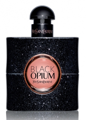
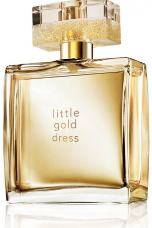
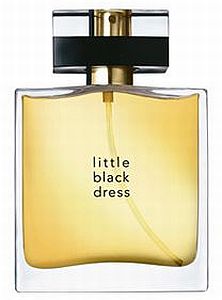
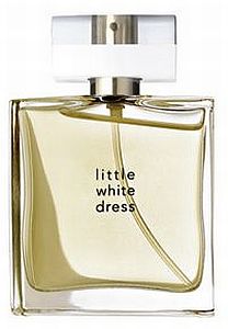
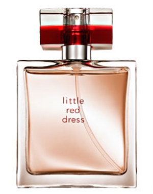
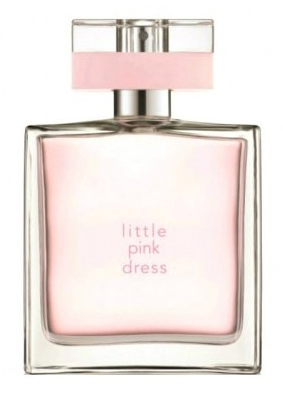
The second half of this brief I was photographing perfume bottles, I researched into the intended brand identity and the target audience for the perfumes; I then created a photograph that could be used on websites or billboards to advertise the perfume bottle. I did this so that I could change from the standard portrait orientation style works that are typically produced. Working with these bottles has inspired me to continue photographing in this style as I enjoyed it immensely and I think the skills that can be learnt are easily transferable onto other product works.

Overall I think that this project has been a success as I have learnt many new skills and I have found work I want to continue working in this style in future projects. I think over the course of this project I have developed more into my own style and that this has become noticeable and recognisable as my works. I am also feeling more confident with working in front and collaboratively with people although I do still struggle with some types of personalities. I did not run into any major problems during the course of this project and the only final outcome I do not feel is successful is the Food workshop.

If I was going to change anything in this project I think I would spend more time perfecting the Food outcome and perhaps try reshooting in the studio so that I can better control the lighting. Another point of change is the Documentary workshop as I neglected this slightly as I did not enjoy shooting in the style of documentary, I would take more time to develop my idea further and expand this workshop further in depth by taking more photographs out on location of peoples jewellery boxes.


I want to continue in the Commercial Pathway because I enjoy working in this style and creating works for “clients”. I feel that this series of work is my strongest outcome from the modules so far and I want to expand and develop my portfolio with similar series of works. I want to learn more skills that will help me succeed in the retouching industry and I feel that working commercially over the next year will give me more opportunities to practice and that experience will be valuable, furthermore I feel that the networking skills I can learn will also be very beneficial to me.

Still life objects


https://www.flickr.com/photos/jmsetzler/sets/72157602189655463/

This link takes you to John Setzler's Flickr page where a collection of his work is being showcased in an online portfolio/ selling archive.

I like the close up details that can be seen in his work and I would like to work in macro as well as I think this will be effective in this project as many objects are small and have details small and visible close up.

I also like the way he has creatively captioned his work I do not this captioning would be suitable for the commercial style but nearly all adverts have accompanying text overlaid on the top of the image so it would be good for me to start and create my own "advertisements" by incorporating text with my work.

Tuesday 12 May 2015

Perfume Final Shoot


This is the final shoot I have done for the perfumes. After looking through my final successful outcomes for this project I had narrowed down some that I was thinking creating a set from. I booked this final shoot so that I could improve on some of the minor flaws within the photographs. However while I was shooting I came up with a new idea for a series and I expanded this idea and shot the photographs in this shoot.


Outcomes


I had previously shot these photographs against a black background however he said that white would make this look stronger as the black made the bottle look like a Christmas bauble. I could not remember my lighting set up for the previous photograph so I used a softbox placed at the side to light this. I could not get rid of the blown out spots on the lid however. I decided I was going to come back to this photograph later however while shooting later on I changed my idea for my final three.


In this set up I tried to play more with the coloured shadows that appear from this bottle. I could not get them as visible as I had hoped for though, there was also the problem of not being able to get rid of the softbox reflection while still being able to light the bottle properly.


From a previous shoot I had already decided that this composition was going to be one of my finals, I wanted to expand on the composition more to see if I could improve it. I tried the photograph on both sides of the frame however to me the photograph on the left appears peculiar I think this is because our eyes are trained to read from left to right and in this photograph the main focus is on the right.


With this bottle I used a material that is the same colour as the bottle to highlight the colour, it reminded me and my friend of water which is why in the second photograph I have added glycerine to the bottle, at first I added glycerine to the whole bottle including the clear lid however I also tried photographing it without the lid and then with a cleaned lid so I had the options there and I preferred the photograph with the clean lid. The small blue corner comes from how I have moved the scarf around behind the bottle and I am going to take this out for my final outcome. I have also left in two softbox reflections on the sides to help add definition to the bottle and also separates the bottle from the material.


I wanted to use this bottle in my final series because of the sparkle details that can be seen in the bottle. I set this up similar to the previous two bottles so that it would fit with the series, I then set about trying to be able to light both the writing on the glass centre and the writing on the lid with reflectors.


In these two photographs I have added coloured beads so that the photograph has some colour element. I started with the gold beads because of the colour of the writing on the lid, however this overpowered the bottle so I changed and used a more toned down colour of an off white set of beads. With the bottle in this position I had to build a makeshift reflector tent around the bottle as I was the only one in the studio so I could not hold three reflectors and fire the camera all at once (I decided in this moment that capture one should make an option for a "fire camera" voice command).


Set Up


This is the makeshift reflector tent that I built up around the bottle of perfume.


Thursday 7 May 2015

Perfume Part Four


In this shoot I was helping to assist some other students in the morning and then I had my own shared studio time on the afternoon. They had set up the studio with three lights, two softboxes; one on either side of the table and one behind the table bouncing light off the white background and through a diffuser screen.

Outcomes


These photographs show a bottle that I have borrowed from one of the girls I was assisting, the shoes are also hers; I combined them and the perfume because of the gold within them both. I am not sure about using the flower because I know it is not a flower that the perfume smells of.


I tried some photographs without the flower in and I found that I prefer these photographs more. The photograph on the left was taken without a reflector and the one on the right was taken using a small white reflector from underneath the camera to bounce light onto the lid. I also moved the shoe because of the reflection that was showing and because the shoe blocked the detail on the writing on the bottle.


These photographs I took just of the bottle on its own, I prefer the photo of the bottle without the lid on because I kept forgetting to rearrange the reflector and the detail in the lid was lost. I also like the minimalistic look to this photograph and I think it suits this bottle.


I like the way the colour pops out in this bottle however I do not think I could use this bottle as a final because it is only half full and this would not be used as an advertising piece but it was good practice to be able to use this bottle. In the photograph on the right I want to change the reflection so that the writing reads the right way up however I do think that it would look right and could confuse many viewers. I like the petals in the photograph as they help tie in the flower.


I think that this flower matches the delicate "girly" nature of this perfume, the colours compliment each other however I think the flower looks a little like it is dying and if I was going to shoot again I would use a few of these flowers in a bunch. I prefer the photograph where the flower has a little of its stalk showing because then it is obvious that the flower is a flower.


The differences between these two photographs is that in the left photograph the flowers are real and in the right photograph the flowers come from a headband. I prefer the fake flowers as the colour matches better; also I do not think it is obvious at first look that they are fake. I do not like the positioning of the flowers in either of these photographs as I think they overcrowd the bottle.


The flowers in the right photograph look better because in the left photograph the writing on the bottle gets lost, to raise the bottle I have sat the bottle on a roll of masking tape that it sat behind the flowers out of sight. I also tried some shaken bottle photographs but because the bottle was difficult to stand on the tape it was difficult to shake and balance the bottle while the bubbles were still visible. I think I am going to develop the right photograph some more as one of my final photographs because this is one of my strongest photographs that I have taken so far.


In these photographs I added a string of beads to the bottle, I did this because the perfume is aimed towards females and the beads help add to the connotations of femininity. I prefer the photograph where the bottle is sat on the black material as it helps break the colour up. I also think the pink box does not look right as it is not a full box but it is the box that the perfume comes in, I used this box because the pink colour matches the bottle however I think it needs the black to highlight the bottle.


I thought I would expand the black material because of how it contrasts with the bottle however the writing on the bottle is not very visible so I move the black cloth up to provide more of a background for the bottle. In the photograph of the bottle on the right it appears as though the bottle is wearing a cape of the black material and I quickly realised that I would have to move the background up so that it covered the full background.


In these ones I have moved the black cloth so that it created a full black background, this looked instantly better than before however the photograph looked slightly empty so I combined both the bottles in the frame. I had to rearrange the bottles so that the lighting hit both the writing in the bottles, I also had to use reflectors to change the lighting on the pink bottle.


In these photographs I changed the angle on the camera to be able to take overhead shots. I think the shape of the air bubble in the pink bottle but I think the bubble in the red bottle is too large however. The backgrounds match the bottles very well, but I think I need a reflector in the red bottle because the details in the lid are slightly lost.


I tried using this bottle as well as the "Little Dress" bottles in an overhead shot. For this bottle I sat it inside a roll of masking tape so that it appeared as though it was standing up. It took a while for me to be able to angle the bottle so that the writing in the centre was visible. I then realised I would need to more reflectors than what I had to change the reflections in the lid. I am going to try continue with this bottle for my final as I think the outcome on the left is another of my strongest so far.


Set Up


Wednesday 6 May 2015

YSL Black Opium


This is an example of the advertisement used for YSL Black Opium perfume, the bottle has a halo light around the outside which can easily be added in Photoshop. The glass centre in the bottle has been lit so the colour can be clearly seen while also showing the details in the sparkles and the writing on the lid, personally I think this is a composite of many different shots with different lightings as not all the parts of the bottle would be visible at once.


These are some other photographs of the bottle I have found which caught my eye as they are very different composition wise.


Tuesday 5 May 2015

Little Dress (perfume research)


These are all example photographs of the bottles in the collection, there are also different versions of some of the bottles as they have released different sizes and special editions. In some photographs the inside stem of the lid has been removed and in others it has been kept in, I am not sure if I want to remove it in my photograph of this bottle as people expect it to be there and visible and removing it could cause some confusion. In none of these photographs the bottle has been shaken so there is bubbles inside the bottle, I still prefer my own shots with the bubbles visible so I think I am going to continue shaking them. From the reflections on the lids the bottles appear to be lit with softboxes on the side, some bottles look to have two but others have one.


Little Pink Dress


These are some of the photographs of the Little Pink Dress bottle when being used in an advertisement. I like the idea of combining the bottle with props, but since this is a "Still Life" module I am not going to be including models, however flowers and other props can still connote femininity.


Little Red Dress


In this photograph the pattern in the background mimics the pattern from the front of the box, I might try combining this pattern with the bottle however I am not sure how I could create this.