Thursday 26 February 2015
Documentary Still Life
Narelle Autio - "The Summer Of Us"
The exhibition layout of this series reminds me of how some people collect and layout memory photographs on their walls in their houses. It creates a more personal connection between me and the photographs because I feel I can relate to the connotations of a memory wall.
The minimalistic style of this work adds more aesthetic quality because they are visually similar so they all create focus on the objects rather than the location, I think if these had been taken with sand and other objects in the background they would lose some aesthetics because the focus wouldn't be solely on the object.
http://www.stillsgallery.com.au/artists/autio/index.php?obj_id=series&nav=8
Raphael Dallaporta - "Antipersonnel"
He has photographed different land mines as though they are a high end retail item; personally I think this gives a striking juxtaposition of the styling in relation to the object itself. The lack of background in this series only highlights the object more. If this series had been taken differently (on location with background detail) I think it would have lost effectiveness of the juxtaposition however it would have been more effective in showing the destruction it can cause if it had been shown in the aftermath of the explosion.
The context of what the objects are give a deeper meaning to the photograph and change the perception and how we receive the photograph.
http://artblart.com/tag/raphael-dallaporta-antipersonnel/
Monday 23 February 2015
Black on Black
In another shoot in the studio me and my friend also tried to shoot some black shoes, we know we can shoot white products on white backgrounds so we wanted to try lighting black products on a black background.
I think the shoot was successful however I do not feel as though they can be used in a product sense because the overall photograph is too dark and many of the details are lost.
I moved the light to behind the shoe in order to create a spotlight effect at the back of the shoe, this had an interesting outcome. I also played with the shadows that were cast from using the snoot up high.
My Outcomes:


Friday 20 February 2015
Zombie Jelly Babies
So after the workshop I wanted to try out creating my own Jelly Baby advert. This was not a very "technical' successful shoot however I think I was very creative during this shoot. I played around creating the jelly babies in little scenes and I set up a scene which made it look like the jelly babies were that tasty that they just had to eat themselves and I set them up to look as though they were zombies chasing a "human" jelly baby (I don't know else to describe the difference in the zombie/non zombie jelly babies)
My Outcomes:


Thursday 19 February 2015
Product Workshop
In this workshop I had to work with another group to produce each of the items on the brief :
- A white golf ball against a white background
- A Package shot
- A creative advertisement for Jelly Babies
In our workshop allocated time we only managed the first two because we were struggling to light the golf ball and not get any blown out highlights while still retaining a well lit photograph. For our golf ball we lit overhead from behind with a soft box and used white reflectors to bounce light back up into the bottom of the ball.
We also had to work on a packaging shot, my group had the Oakcakes packaging; we found quite a few problems while photographing this because the top of the box would not shut properly and kept lifting, we tried to fix this with masking tape however this did not completely solve the problem. Another problem was the shadows cast from the box made some of the text hard to read, we managed to fix this with reflectors and changing the lights around eventually.
We also tried to create some styled shots (ones that also included the oat cakes as well as the box) I prefer these as an overall photograph although I know the purpose of the packaging shots would be so it could appear in food catalogs it does not need to be a visually pleasing photograph as long as it fulfils its purpose of showing off the product.
Unfortunately I do not have these photographs to show as while I thought I had copied the Capture One session onto my hard drive I had not and the technicians have cleared the computers memory so I can not recover it.
Comercial Advertising Photography
Commercial or Editorial ? Whats the difference?
The differences between Editorial and Commercial are quite simple:
- Commercial photographs are being used to sell the product by only using the photographs
- Editorial photographs are showing the product but this also being accompanied by an article of text which goes into more detail about the product, such as recipe books or magazine pieces.
Commercial photographs are being designed to persuade the viewer to want and need the product, this is done more effectively when the photographer understands Semiotics; this is the meanings and significance of objects and colours within the photograph. The visual elements will connote specific thoughts and reactions in the viewers, all of the viewers look at the work with preconceptions of the world and it is the job of the creatives to understand how people will read and react to the work so that the can create the most effective advertisement.
Brands are cultural entities that need to be understood as they have all created an identity that fits with the target audience and the culture that they have been created in. To create a new brand the culture that it will be presented in needs to be understood in order to reach maximum potential.
In this lecture we also looked some product photographers:
David Parfitt
He shoots a variety of products but the most interesting to me is the perfume bottles that he shoots, to shoot a perfume advertisement the brand identity and also the style and the purpose that the perfume has been created for (days, nights, who is the target?). Semiotics will help the photographer understand how his photograph will be coming across as even something as the colours used in the background will affect how the viewers read the photographs.
Ray Massey
This photographer specialises in shooting with liquids and splashes, he also does his own retouching which is useful because he understands his vision and he can execute it himself without having to rely on another to understand his vision. The way he photographs liquids is a talent I would like to improve on as I think it creates an usual look that is not typical.
Eugenio Franchi
Both a photographer and a retoucher he creates extraordinary works that showcase the products, he has worked for many companies in creating advertisements. The drinks portfolio he has on his website shows spilling drinks and I think that this would be a great project to try myself.
Wednesday 18 February 2015
Products And More Products
Me and my friend were in the studio shooting some products against a white background, during the shoot I photographed some CD's because I wanted to see if I could manage to photograph them without any glares or reflections. That was easier than I thought because of our set up there was no glare on any of the CD's and the only thing I had to change was the position of the CD because the reflection of the glass it was stood on created a line through the middle of the front cover.
We also photographed a box of eclairs as both just a packaging shot and also in a styled advertisement shot with some of the eclairs visible as though they have spilled out of the box. I like these shots because the eclairs and the angle of the box invite the viewer in to the image and creates a desire to have some for yourself which is how an advert works. We had trouble being able to angle the reflector to bounce light into the back of the box so that all the text was visible.
I also tried to light some Fanta bottles although this did not turn out very well because I was not familiar with shooting clear objects and the lighting needed for that (or in other words because I just didn't know what I was doing.) I tried out backlighting the bottles so that the colour shone through however this blew out the edges of the bottle at the top where there was no Fanta to show the edges. I will have to revisit these bottles later on.
My Outcomes:


Tuesday 17 February 2015
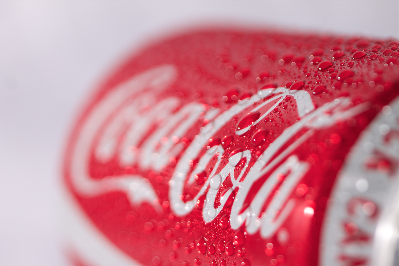
Just Chilling
So this weekend I have set up my home made studio space in the kitchen again and photographed some cans of coke against my white tablecloth using a remotely triggered flash gun.
I was photographing a closed can that was still full however I did not feel it was working and I thought that maybe an open can would be more appealing so I opened the can and instantly it looked better.
Then I wanted to play with creating a sense of the chilled sensation you get when having hold of a cold can. I had bought some Glycerine after the tutor told us about the way it was used to create the droplets so I decided to try and create my own droplets. I mixed the Glycerine and water in a spritzer bottle and tried it out, the droplets were a little too runny however I added some more Glycerine to the mixture and this worked better so I kept adding until they stayed in the same place they landed. Then I cleaned the can so that there was no running water marks down the sides and resprayed with the new sticky droplets.
The droplets were so effective in making the can look cold that I expected the can to be cold when I picked it up myself, even though I had known it was room temperature from the beginning of the shoot.
My Outcomes:


Monday 16 February 2015
Product Photographers
Production Paradise
http://www.productionparadise.com/spotlight/still-life-photography-460.html
This website has a collection of photographers who have signed up, I have looked through some of the still life photographers so that I can get some ideas on shooting in a commercial style.
Bruce Anderson
http://www.productionparadise.com/spotlight/still-life-photography-865/bruce-anderson-25997.html#photo
This is one of the photographers from the Production Paradise website, he is an advertising and editorial photographer. He produces very high quality close ups of the products, I think this is useful in product shots because then the details can be seen clearly and easily.
Julian Dann
http://www.juliandannphotography.co.uk/Commercial-Product-Photographer.html
On his website is a range of the different styles that he shoots in, he shoots to match the clients vision and gives them the shots they desire. Being able to shoot a wide variety of styles is very useful as although clients may come to you because of your specific style, more clients will be attracted to your work if there are more styles available as each person has a different style and taste.
Thursday 12 February 2015
Dont Daydream .. Too Much
This lecture was about ways to expand our creative horizons, I think this lecture was useful to me because in many projects I have struggled to come up with an idea instantly like many other people can do.
Don't Daydream .. Too Much
- it's good to daydream and think about things, but dont spend all your time doing this, you need to get out and create those daydream ideas
Observe ... EVERYTHING
- people on public transport, trees, the way light falls, food
Work The Hours
- when am I most productive?
Solitude Time
- Thinking and refreshing time purely for me
Problems into Positives
Gain New Experiences
- small as a new route to work or travelling to a new country
Fail Up
- learn from mistakes, make yourself better from it, redo it
Ask The Big Questions
People Watch
Take Risks
- being a student I have the possibility to take risks and explore things without worries
Funding
- Crowdfunding, Kickstarter
Follow my Passions
Get Outa My Head
Thursday 5 February 2015
Studio Strawberrys
This is a shoot I have done in the studio using a torch to try and play with some light painting that I found online (see previous posts) I wanted to create a red trail of light around the strawberry however this was quite unsuccessful. I lit these photographs with a torch light as I wanted to use it to highlight only certain parts of the strawberries.
What I managed to achieve was creating some macro shots of the strawberries with the focus on the details in the seeds and I also experimented with some styling as I included strawberry flavoured sweets and cupcake wrappers.
I think the cupcake wrapper shot looks too abstract to be used as a final because at first glance it is not possible to understand what it is this was pointed out to me in the crit that we had where I showed my strawberry shots off.
Another few comments were made about being careful when using a shallow depth of field as I had placed the focus in slightly the wrong area that it should have been (more in the middle of the frame than the foreground)
My Outcomes
These are some of my outcomes for this shoot:
This photograph uses extreme macro to get up close and personal with the strawberry's seeds:

I then placed the strawberry into a cake wrapper to signify strawberry flavoured cake:

With this photograph I have taken more care to style the strawberries using a variety of props such as doilies, sweets, wooden frames and a chopping board. I like the effect of the bokeh effect in the first image however the exposure is incorrect. I think the most successful of this shoot was the final image because of the styling and the correct exposure, unlike the others this photograph was taken with a studio flash rather than the torch light I used for the others.


Styling
The tutor recommended we check out the book "Food Styling" by Delores Custer
I also noted a list of useful items that help in the styling and making of the food photographs :
- Reflectors
- Cloths
- White duct tape / White tac
- Cocktail sticks
- Spares !! (photo equipment, food!)
- Different lenses, extension tubes
- Portable Steamer (Fabric steamer - adds "smoke" to food)
- Cotton wool balls (add hot water, also creates steam/smoke)
- Cooking oil
- Plastic ice cubes
- Paint brushes (adding sauce to dishes)
- Glycerine (in a spray bottle with water creates droplets)
- Range of Backgrounds (sourced from antiques shops, charity shops, skips)
- Tweezers
- Scissors
I also made a list of some possible garnishes that could be used on the products, using these would probably need more knowledge of the tastes and recipes so to know what would work in combination.
- Basil leaves
- Crumbs / Seeds / Rinds / Peel
- Spring onions
- Sauce (double drizzle)
- Berries
- Salt
- Micro greens ie cress
- Grated cheeses
Wednesday 4 February 2015
Splash!
In this shoot I have set up a tablecloth in my kitchen (pinned to the kitchen cupboards and laid out over the counter like a roll of backdrop paper) then placed a bowl of strawberry milk in the centre of it. My idea for this shoot is to create a splash photograph that shows the strawberry dropping into the bowl so that the viewer gets the connotation that the milk tastes of fresh strawberries.
I am using a flash gun to light this set up, fired off using a wireless trigger so I can control it better and place it to the side (both to create side lighting and so it is not in "the splash zone") I have also set up the camera with my 100mm lens so that the camera can be placed out of "the splash zone".
My assistant will be dropping the strawberry into the bowl and I will be behind the camera.
Update:
It was a lot harder than I first thought to create these photographs as many many times (at least 95% of the time) we did not time the drop perfectly and the splash was missed so I ended up with nearly 200 photographs of just the empty bowl or with it flying through the air.
The few photographs that did capture the strawberry were not as well lit as I'd hoped, I think I have placed the flash too far back to be able to light the strawberry, so next time I am going to have to move the flash somewhat closer. At first my assistant was holding the strawberry by the stalk and dropping it the right way up, however this meant that when I did capture the strawberry it was mostly leaves and that did not give the impression I was hoping for. We changed this up after a few shots so the strawberry was being dropped upside down, this meant when I was timed enough to catch the strawberry it was showing it like I wanted.
I think I am going to continue this splash idea for my final piece in the food photography. I think I may change the container I used though and use one with a wider surface area so that less of the background and the container can be seen.
Outcomes :
These are two of the successful images alongside a close in crop of the same image. I think the close up ones are more successful as the splashes on the bowl are quite distracting.


Sweets - Thinking Ahead
 |
| photographs from the link below |
http://solent.photoshelter.com/gallery-image/Sweets-in-water-droplets-by-Patrick-Lindsay/G0000IkRO1fYM6ug/I00005_blATihkt0
http://www.kalory.co.uk/2013/06/packshot-photography-in-studio-for-sweets-in-the-city-making-of/
For the second half of this brief we must create a series of photographs that relate to each other, one possible route for this is sweets as there are so many different sweets available and ways that they could be shot. I also think that the colours and the details will be great to work with and I could get some excellent portfolio photographs.
I started thinking about what I could use while I was on the bus and came up with a list of props and a list of possible sweets.
Possible Props:
buttons
cellophane
string
jewels
cupcake wrappers
doilies
ribbon / bows
coloured backgrounds
fishing wire (tie up the sweets so they are hanging)
Sweets
haribo
millions
gummy bears
skittles
jelly babies
smarties
lollipops
gobstoppers
fruit pastilles
strawberry laces
fizzy laces
Tuesday 3 February 2015
Don't Let me in the Kitchen!
So over the weekend I went into the kitchen and I baked some cupcakes (or well tried) so that I could try photographing them on a location. I wanted to create the kind of look that felt as though it was a family baking time and this includes the typical mess of cooking with children (even though I made that mess all by my self!)
My cupcakes didn't quite turn out as pretty as I'd hoped, they looked a bit flat and small but I still tried to photograph them all the same and I like my outcomes all the same. I also decorated them with icing and sprinkles (which is what made the mess).
My Outcomes:


Monday 2 February 2015
Wine Splashes (sort of)
Influence
http://ibakeheshoots.com/impress-friends-splash-photography/
 |
| Image from "I Bake He Shoots" |
This photograph I found on the website "I Bake He Shoots" and it inspired me to create my own photograph of this as I was already experimenting with splash work.
My Outcomes


Not quite the same as I set up on the kitchen counter at home using a table cloth pinned up to the cupboards as a backdrop and only used a remotely triggered flash gun to light this scene. Other lights that can be seen reflected in the glass are the kitchen lights behind the camera and the window light.
I used Powerade in my glass to get the blue liquid and I had my assistant drop frozen ice cubes into the glass from above, the ice cubes had green food colouring in as I found that when the ice cubes could not be seen inside the glass it looked a little strange as to why the glass is splashing whereas with the inclusion of ice cubes it made more sense. I experimented with using plain ice cubes, food colouring ice cubes, milk ice cubes and diluted juice ice cubes however the milk and most of the coloured ice cubes had not frozen overnight so they could not be used.
I also found that because of my framing the left over splashes were contaminating the background (as seen in the green glass photograph) and for my next shoot like this I would have to change my framing so the bottom of the glass was not visible.
I like the idea of continuing this but I do not like the outcomes from my shoot as they look too messy and unprofessional, I am going to experiment more with this idea and I think I am going to change colour of the liquid and dilute it so that the ice cubes become more visible, plus i am going to look at adding something to the centre of the ice cube so that it is more visible as well. I will also need to rearrange the backdrop so that in the glass reflection the edge of the counter is not visible (the black curved line is the floor of my kitchen and the white underneath is the tablecloth on the background).
Fun With Fruit
http://photography.about.com/od/photographybyoccasion/qt/fruitinwater.htm?utm_source=pinterest&utm_medium=social&utm_campaign=shareurlbuttons
 |
| Photograph taken from the website (link above) |
Fun with Photography - Fruit in Water
This website hosts a number of useful photography related articles and this article features a new way to photograph fruit - drop it into water this will be fun to try and do although I think that getting the look right and catching the timing of the fruit will be difficult.
More Bubbles in fruit
 |
| Photograph taken from the website (link below) |
http://www.boostyourphotography.com/2014/01/fizzy.html
Subscribe to:
Posts (Atom)